


.png)

Tagline Text
Lorem ipsum dolor sit amet elit
Lorem ipsum dolor sit amet, consectetur adipiscing elit. Suspendisse varius enim in eros elementum tristique.
Components allow you to maintain a consistent, efficient, and scalable website by creating customizable blocks from elements and child elements. Reuse those blocks across your site, and modify them in a single place to avoid individually revising each recurring layout. Throughout Lumos components are used for Navbars, Footers, Buttons, and specific sections or layouts like a CTA section. This page should get you up to speed on how to edit components and also includes a list of the components used in this site below. For a full guide on using components check out the Webflow University page.
To make the same changes across all instances of a component, you’ll need to edit the main component. You can edit the main component on any component instance by:
When you do this all other elements on the page will get a dark overlay to show that you are updating the main component and that any changes to it will affect all other instances of that component.
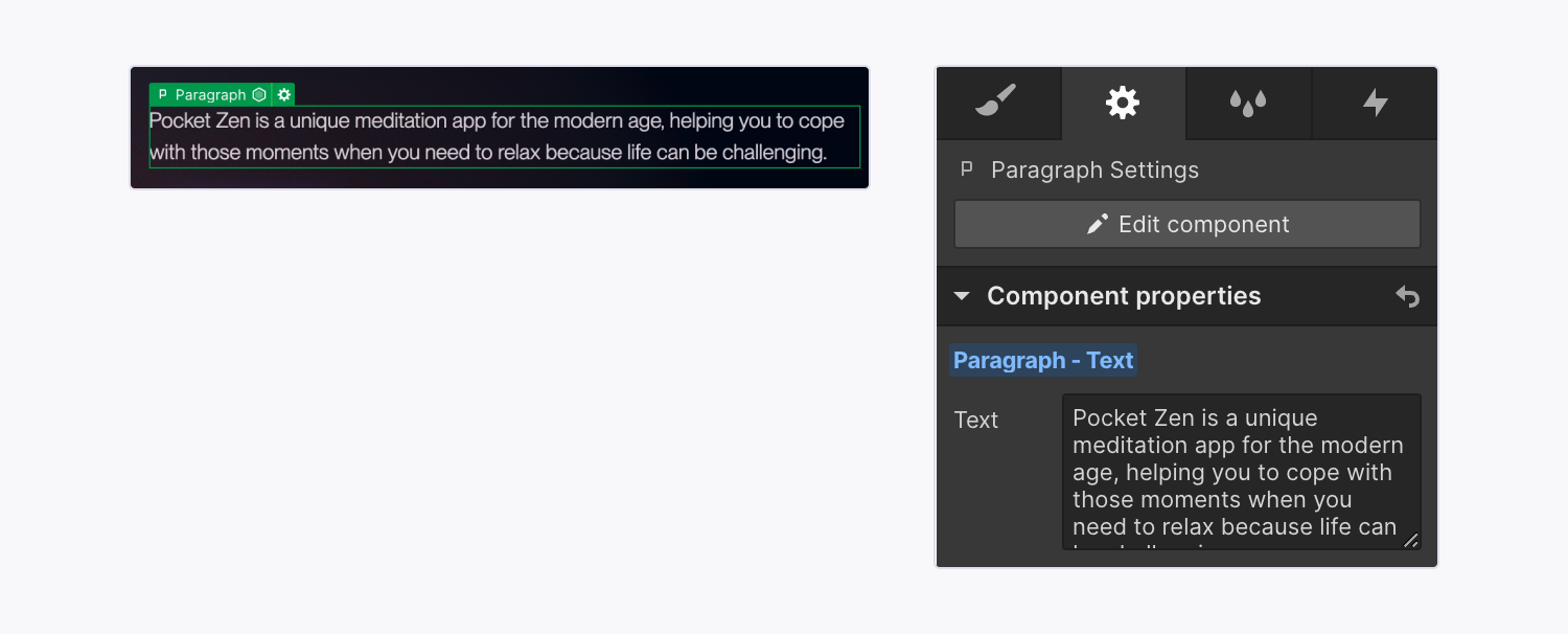
Component properties let you define specific elements within a component that can be modified with unique values on a component instance. For example you could make a CTA section that has an editable title and button. In more advanced use cases component properties can also show and hide specific elements, or even change visual styles (like button style, spacing amounts, or section color).
To edit a content property (eg a heading or image) you should:
Note: Some components (like a Navbar) might not have any properties set up because instead of having the component include different content on each page it needs to be consistent across the site without any parts of it changing.
Lumos allows you to update visual styles within some components by using component properties. Since each component property is given a name (and often a placeholder) use this to understand what modifying that property will do to the visual style. For example, if you update a heading class from u-text-style-h3 to u-text-style-h1, it will modify how the heading looks..
Most of the custom style properties are allowing you to select a CSS class for a specific use case (eg changing a color theme, or a border radius). To view all the possible classes for each of these use-cases checkout the style guide.
Feel free to play around with these properties when modified a component to see what visual changes are available. That being said it is recommended to clear out any overrides of a property if it is not having any effect. Eg. don't write something the doesn't work into a Color Theme property like dark or 10 if those options don't do anything, just leave the property blank (you can click on the blue text in the property to reset it).
Some components will allow you to enable or disable interactions by using true or false (eg Scroll In Interactions = true). Or may give you more detailed options like allowing you to choose between a few different animation types, or giving you options for duration. For more details on how to customize these interactions check out the documentation.
Some components allow you to put other components inside of them for even more flexibility (like putting a bunch of cards into a section). to do this you can simply drag a component from the sidebase into the canvas and re-arrange them how you want, or even copy and paste another component to create more of them.
It's important to note that while Webflow will allow you to put any component inside a component slot, not all slots are meant for all components, (eg, sections should not be put inside other sections) to solve this components are divided in the sidebar based on their role. As a general rule, only Cards/Slot elements should go inside of a slot within a section. More on component naming is explained below.
One other thing you'll notice is that components have different types of names related to how they are used. Often this will include several words or phrases separated by a slash. This is to help you quickly search through and add components. The most common keywords are explained below:
If you are using components a lot I would highly recommend installing the lumos chrome extension - It will pull out values from the custom code to make it easier to see what your options are when modifying a components styles. Chrome extension is linked here.
The components used in this site are displayed below, feel free to copy and paste them onto new pages or modify them to familiarize yourself with each of their options. Note: The navbar is not included on this page but you can find it on almost any other page throughout the site.
Lorem ipsum dolor sitipiscing elit. Suspendisse in eros elementum tristique.
Increase in profits

Tagline Text
Lorem ipsum dolor sitipiscing elit. Suspendisse in eros elementum tristique.
Lorem ipsum dolor sit amet, consectetur adipiscing elit. Sus erosem vitae risus tristique posuere.
Text subtitle with a description
Text subtitle with a description
Text subtitle with a description
Header / Simple
Lorem ipsum dolor sit amet, consectetur adipiscing elit. Suspendisse varius enim in eros elementum tristique.
Header / Stacked
Lorem ipsum dolor sit amet, consectetur adipiscing elit. Suspendisse varius enim in eros elementum tristique.


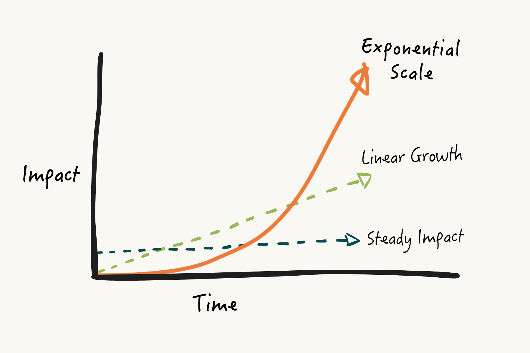
From zero to 30M trained

From zero to 20M farmers insured

From 10M to 50M monthly viewers
From videos to AI for Farmers

From 80K to 1.5M people with new access annually

From an idea to 6M people with healthcare

From an idea to national programs

From data to global users

From zero to 6K employees and 2M farmers

From 1 village to 1.4M girls back in school

From 1 clinic to 3 countries

From 1 district to 4 countries

From 10 to 59 partners

From 1 village to 13 countries

From 10K to 600K kids fed daily

From 30K kids to over 1M kids

From startup to vaccines for 14% of all babies

From 1 road to every dangerous Indian highway
Cards / Horizontal
Lorem ipsum dolor sit amet, consectetur adipiscing elit. Suspendisse varius enim in eros elementum tristique.
Lorem ipsum dolor sitipiscing elit. Suspendisse in eros elementum tristique.
Lorem ipsum dolor sitipiscing elit. Suspendisse in eros elementum tristique.
Lorem ipsum dolor sitipiscing elit. Suspendisse in eros elementum tristique.
Cards / Horizontal
Lorem ipsum dolor sit amet, consectetur adipiscing elit. Suspendisse varius enim in eros elementum tristique.
Find
Lorem ipsum dolor sit amet, consectetur adipiscing elit. Suspendisse varius enim in eros elementum tristique.
Organizations we looked at last year
Fellows over the years
Fellows funder per year
Find
Lorem ipsum dolor sit amet, consectetur adipiscing elit. Suspendisse varius enim in eros elementum tristique.
Six ways to do more with less.
December 14, 2016
Old-school development and its rusting reminders.
May 30, 2013

Poverty lines, how Africa works and the problem with RCTs.
April 30, 2026
The problems are big, the time is short, and the resources are limited.
April 16, 2026
Some deep links in this edition for folks who really, really care about impact and scale.
December 16, 2025
Lorem ipsum dolor sit amet, consectetur adipiscing elit. Suspendisse varius enim in eros elementum tristique.
Poverty lines, how Africa works and the problem with RCTs.
April 30, 2026
The problems are big, the time is short, and the resources are limited.
April 16, 2026
Lorem ipsum dolor sit amet, consectetur adipiscing elit. Suspendisse varius enim in eros elementum tristique.
Poverty lines, how Africa works and the problem with RCTs.
April 30, 2026
The problems are big, the time is short, and the resources are limited.
April 16, 2026
Some deep links in this edition for folks who really, really care about impact and scale.
December 16, 2025
There is philanthropic investing, and there is commercial investing, and there is nothing in between.
December 11, 2025
Lorem ipsum dolor sit amet, consectetur adipiscing elit. Suspendisse varius enim in eros elementum tristique.
Senior Advisor
Senior Advisor
CEO
Communications Lead
Cards / Main
Lorem ipsum dolor sitipiscing elit. Suspendisse in eros elementum tristique.
Lorem ipsum dolor sitipiscing elit. Suspendisse in eros elementum tristique.
Lorem ipsum dolor sitipiscing elit. Suspendisse in eros elementum tristique.
Lorem ipsum dolor sitipiscing elit. Suspendisse in eros elementum tristique.
Lorem ipsum dolor sitipiscing elit. Suspendisse in eros elementum tristique.
Lorem ipsum dolor sitipiscing elit. Suspendisse in eros elementum tristique.
Lorem ipsum dolor sitipiscing elit. Suspendisse in eros elementum tristique.
Lorem ipsum dolor sitipiscing elit. Suspendisse in eros elementum tristique.
Cards / Main
Lorem ipsum dolor sitipiscing elit. Suspendisse in eros elementum tristique.
Lorem ipsum dolor sitipiscing elit. Suspendisse in eros elementum tristique.
Lorem ipsum dolor sitipiscing elit. Suspendisse in eros elementum tristique.
Cards / Main
Increase in profits
Active Users
Response time
Tagline Text
Lorem ipsum dolor sit amet, consectetur adipiscing elit. Suspendisse varius enim in eros elementum tristique.
Tagline Text
Lorem ipsum dolor sit amet, consectetur adipiscing elit. Suspendisse varius enim tristique.
Tagline Text
Lorem ipsum dolor sit amet, consectetur adipiscing elit. Suspendisse varius enim tristique.
Lorem ipsum dolor sit amet, consectetur adipiscing elit, sed do eiusmod tempor incididunt ut labore et dolore magna aliqua. Ut enim ad minim veniam, quis nostrud exercitation ullamco laboris nisi ut aliquip ex ea commodo consequat. Duis aute irure dolor in reprehenderit in voluptate velit esse cillum dolore eu fugiat nulla pariatur.
Lorem ipsum dolor sit amet, consectetur adipiscing elit, sed do eiusmod tempor incididunt ut labore et dolore magna aliqua. Ut enim ad minim veniam, quis nostrud exercitation ullamco laboris nisi ut aliquip ex ea commodo consequat. Duis aute irure dolor in reprehenderit in voluptate velit esse cillum dolore eu fugiat nulla pariatur.
Lorem ipsum dolor sit amet, consectetur adipiscing elit, sed do eiusmod tempor incididunt ut labore et dolore magna aliqua. Ut enim ad minim veniam, quis nostrud exercitation ullamco laboris nisi ut aliquip ex ea commodo consequat. Duis aute irure dolor in reprehenderit in voluptate velit esse cillum dolore eu fugiat nulla pariatur.
Lorem ipsum dolor sit amet, consectetur adipiscing elit, sed do eiusmod tempor incididunt ut labore et dolore magna aliqua. Ut enim ad minim veniam, quis nostrud exercitation ullamco laboris nisi ut aliquip ex ea commodo consequat. Duis aute irure dolor in reprehenderit in voluptate velit esse cillum dolore eu fugiat nulla pariatur.
Tagline Text
Lorem ipsum dolor sit amet, consectetur adipiscing elit. Suspendisse varius enim in eros elementum tristique.
Tagline Text
Lorem ipsum dolor sit amet, consectetur adipiscing elit. Suspendisse varius enim in eros elementum tristique.
Lorem ipsum dolor sit amet, consectetur adipiscing elit. Suspendisse varius enim in eros elementum tristique.
Tagline Text
Lorem ipsum dolor sit amet, consectetur adipiscing elit. Suspendisse varius enim in eros elementum tristique.
Lorem ipsum dolor sit amet, consectetur adipiscing elit, sed do eiusmod tempor incididunt ut labore et dolore magna aliqua. Ut enim ad minim veniam, quis nostrud exercitation ullamco laboris nisi ut aliquip ex ea commodo consequat. Duis aute irure dolor in reprehenderit in voluptate velit esse cillum dolore eu fugiat nulla pariatur.
John Doe
CEO & Co-founder

John Doe
CEO & Co-founder
Tagline Text
Lorem ipsum dolor sit amet, consectetur adipiscing elit. Suspendisse varius enim in eros elementum tristique.
The best stuff we run into, straight to your inbox. Zero spam, promise. To see past issues, click here.
Tagline Text
Lorem ipsum dolor sit amet, consectetur adipiscing elit. Suspendisse varius enim in eros elementum tristique.
Lorem ipsum dolor sit amet, consectetur adipiscing elit, sed do eiusmod tempor incididunt ut labore et dolore magna aliqua. Ut enim ad minim veniam, quis nostrud exercitation ullamco laboris nisi ut aliquip ex ea commodo consequat. Duis aute irure dolor in reprehenderit in voluptate velit esse cillum dolore eu fugiat nulla pariatur.
Lorem ipsum dolor sit amet, consectetur adipiscing elit, sed do eiusmod tempor incididunt ut labore et dolore magna aliqua. Ut enim ad minim veniam, quis nostrud exercitation ullamco laboris nisi ut aliquip ex ea commodo consequat. Duis aute irure dolor in reprehenderit in voluptate velit esse cillum dolore eu fugiat nulla pariatur.
Lorem ipsum dolor sit amet, consectetur adipiscing elit, sed do eiusmod tempor incididunt ut labore et dolore magna aliqua. Ut enim ad minim veniam, quis nostrud exercitation ullamco laboris nisi ut aliquip ex ea commodo consequat. Duis aute irure dolor in reprehenderit in voluptate velit esse cillum dolore eu fugiat nulla pariatur.